




Coraline Book Illustrations: Original Art, Illustrated Editions & Artists Explained
Since its publication in 2002, Neil Gaiman’s dark fantasy masterpiece Coraline has chilled and enchanted readers of all ages. While Gaiman’s prose provides the eerie skeleton of the story, it is the visual artists who have fleshed out this haunting universe. From the unsettling, scratchy pen-and-ink drawings of the original release to lavish collector’s editions and cinematic graphic novels, the illustrations of Coraline have played an indispensable role in shaping how we perceive the Other World.
For bibliophiles, art collectors, and casual fans alike, understanding the visual evolution of Coraline is key to appreciating its cultural legacy. In this definitive guide, we will analyze the key artists who have brought Coraline Jones, the Other Mother, and the black cat to life, compare the most sought-after illustrated editions, and explore how these visual interpretations compare to the iconic Laika stop-motion film.
The Original Vision: Dave McKean’s Haunting Artistry
To understand the visual DNA of Coraline, one must begin with Dave McKean. A long-time collaborator of Neil Gaiman (famous for his work on The Sandman covers, The Graveyard Book, and Mr. Punch), McKean was the natural choice to illustrate the first edition of Coraline published by HarperCollins in 2002.
McKean’s style for the original release is characterized by its stark, gothic minimalism. Utilizing pen-and-ink drawings with heavy use of shadows, scratchy textures, and distorted perspectives, McKean captured the psychological horror of Coraline’s predicament. His illustrations do not merely depict scenes; they evoke an atmosphere of claustrophobia and unease.
Key Characteristics of McKean’s Coraline Art:
- Distorted Proportions: Characters often feature elongated limbs and slightly exaggerated facial structures, hinting at the unnatural nature of the Other World even before Coraline steps through the corridor.
- Negative Space: McKean masterfully uses vast expanses of black ink and empty white space to emphasize Coraline’s isolation and vulnerability.
- The Button Eyes: Perhaps the most challenging element to draw without looking comical, McKean rendered the Other Mother’s button eyes as deep, reflective voids of glossy black, making them genuinely terrifying.
McKean’s cover art for the early editions—featuring a close-up of a key with a skull-shaped bow—remains one of the most recognizable book covers in modern children’s literature, setting a high standard for all subsequent illustrators.
The Visual Evolution: A Comparative Analysis of Illustrated Editions
As Coraline grew into a global phenomenon, publishers commissioned different artists to re-envision the story for new generations and diverse audiences. Each artist brought a distinct aesthetic, ranging from whimsical dark fantasy to highly detailed gothic realism.
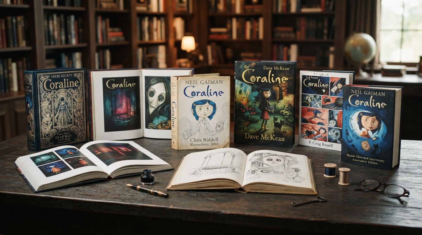
| Illustrator | Edition / Release Year | Primary Medium | Visual Style & Mood | Target Audience |
|---|---|---|---|---|
| Dave McKean | Original US/UK Edition (2002) | Pen-and-ink, multimedia collage | Gothic, abstract, psychological, minimalist | Young Adult / General Fiction |
| P. Craig Russell | Graphic Novel Adaptation (2008) | Sequential comic art, digital coloring | Cinematic, detailed, narrative-driven, classical | Comic lovers, Visual readers |
| Chris Riddell | UK Children’s Laureate Edition (2015) | Fine line-work, ink wash | Ornate, whimsical, highly detailed, classic gothic | Middle-grade collectors |
| Aurélie Neyret | Albin Michel French Edition (2020) | Digital painting, rich textures | Atmospheric, soft-focus, cinematic, emotional | International collectors |
Chris Riddell’s Lavish Gothic Whimsy
In 2015, acclaimed illustrator and former UK Children’s Laureate Chris Riddell illustrated a brand-new edition of Coraline. Riddell’s approach contrasts sharply with McKean’s. Where McKean is abstract and shadowy, Riddell is meticulously detailed and ornamental.
Riddell’s Coraline is expressive, with large, curious eyes and a mop of wild hair. His depiction of the Other Mother is a masterclass in character design: she starts as an elegant, towering figure with Victorian sensibilities and slowly degenerates into a jagged, arachnid-like nightmare. The inclusion of intricate borders and spot illustrations on almost every page makes this edition a favorite for younger readers who appreciate visual clues to accompany the text.
The Graphic Novel Adaptation by P. Craig Russell
For many readers, the definitive visual version of Gaiman’s novel (outside of the movie) is the 2008 graphic novel adaptation illustrated by comic book legend P. Craig Russell. Translating a prose novel into a sequential art format requires a deep understanding of pacing, panel layouts, and visual motifs.
Russell, who had previously adapted Gaiman’s The Sandman: Dream Hunters, brought a clean, classical comic style to the book. His lines are precise, and his character designs are highly grounded. This realism makes the supernatural elements, such as the grotesque, mutated forms of the Other Father and the theatrical Miss Spink and Miss Forcible, stand out even more dramatically.
Why the Graphic Novel Stands Out:
- Sequential Tension: Russell uses panel transitions to build suspense, such as the slow, agonizing reveal of what lies behind the locked drawing-room door.
- Color Palette shifts: Colored by Lovern Kindzierski, the graphic novel uses a drab, muted palette of greys, browns, and pale blues for the real world, which shifts into vibrant, deceptively warm, and ultimately garish neon tones in the Other World.
- Fidelity to the Text: Because it is a graphic novel, Russell is able to include almost all of Gaiman’s original dialogue and narration, making it the most faithful visual adaptation available.
The Anatomy of “The Other Mother”: How Artists Visualize Coraline’s Nightmare
The success of any Coraline illustration hinges on the portrayal of the Beldam (the Other Mother). She is one of modern fiction’s most compelling villains—a predatory entity that mimics maternal warmth to trap her victims. Analyzing how different artists tackle her transformation reveals a lot about their creative philosophies.
The Three Stages of the Beldam’s Visual Transformation:
- The Mimic: Initially, she must look almost exactly like Coraline’s real mother, but “better.” Illustrators achieve this by making her taller, her skin a fraction too pale, and her smile slightly too wide. Dave McKean emphasizes her stiff, puppet-like movements, while Chris Riddell highlights her overly manicured, needle-sharp fingernails.
- The Unraveling: As Coraline resists her, the Beldam’s disguise begins to crack. Her fingers grow longer, her teeth sharper, and her temperament volatile. In the graphic novel, P. Craig Russell subtly alters her facial structure across pages, making her look increasingly skeletal.
- The Arachnid Form: In her true state, she is made of bone, metal, and sewing needles. Visualizing this requires a delicate balance of organic and inorganic elements. The illustrations must convey her terrifying speed and fragile, yet lethal, construction.
“She looked a little like Coraline’s mother, only… her skin was as white as paper. Only she was taller and thinner. Only her fingers were too long, and they never doubled, and her dark red fingernails were curved and sharp.” — Neil Gaiman, Coraline
The Role of Professional Illustration in Dark Fantasy Publishing
The enduring popularity of illustrated editions of Coraline highlights a broader trend in the publishing industry: the irreplaceable value of high-quality, bespoke book illustrations. Dark fantasy and horror, in particular, rely heavily on visual world-building to bridge the gap between the mundane and the supernatural.
For independent authors, publishers, and creators looking to capture this same atmospheric magic in their own projects, working with experienced artists is crucial. Agencies like Vox Illustration serve as vital partners in the creative process, offering professional book illustration services that help bring complex, imaginative worlds to life. Whether it is designing a haunting book cover or creating full-color interior plates, professional illustrators know how to translate written subtext into striking visual metaphors that resonate with readers.
Collector’s Corner: Finding the Rarest Illustrated Coraline Editions
For book collectors, obtaining different illustrated versions of Coraline is a highly rewarding pursuit. Several limited and special editions have been released over the years, many of which have appreciated significantly in value.
1. The Subterranean Press Edition
Known for high-quality printing and limited print runs, Subterranean Press released a gorgeous edition of Coraline featuring artwork by Dave McKean. These copies, especially those signed by Gaiman and McKean, are highly sought after on the secondary market and can fetch hundreds of dollars.
2. The Folio Society Edition
While the Folio Society is famous for its slipcased, beautifully bound classics, their edition of Coraline features stunning, atmospheric illustrations that capture the timeless, fairy-tale quality of the narrative. The binding design itself is a work of art, making it a centerpiece for any bookshelf.
3. International Editions
Collectors often look to foreign translations for entirely unique visual takes. The French, Japanese, and Italian editions frequently feature localized cover art and interior illustrations by domestic artists who bring a completely different cultural aesthetic to Gaiman’s British-American gothic tale.
FAQs: Common Queries About Coraline’s Visual Universe
Who illustrated the original Coraline book?
The original 2002 edition of Coraline was illustrated by Dave McKean. His dark, abstract pen-and-ink drawings established the book’s gothic tone and heavily influenced subsequent visual adaptations.
Is the Coraline book illustrated in color?
Most standard editions of the Coraline novel feature black-and-white illustrations (such as those by Dave McKean and Chris Riddell). However, the P. Craig Russell graphic novel adaptation and certain deluxe collector’s editions, like the Folio Society release, feature full-color artwork.
How do the book illustrations compare to the Laika movie?
While Henry Selick’s 2009 Laika stop-motion film is visually stunning, it departs from the original book illustrations in several ways. The movie introduces a more vibrant, whimsical color palette (designed by Japanese illustrator Tadahiro Uesugi) and changes character designs—such as giving Coraline blue hair (she has brown hair in the original book illustrations) and adding the character of Wybie, who does not exist in the book or its original drawings.
Which illustrated edition of Coraline is best for children?
The Chris Riddell illustrated edition is highly recommended for younger readers. His detailed, expressive, and whimsical line art helps soften the book’s intense horror elements while maintaining its magical, fairy-tale atmosphere.
Where can I hire an artist to create illustrations in a similar gothic style?
If you are looking to commission custom illustrations with a dark, atmospheric, or gothic feel for your own book, partnering with a professional agency like Vox Illustration is an excellent way to connect with talented artists specializing in diverse publishing styles.