Colors are important in design; that is a fact. But people underestimate how important it really is. Today, we see marketing designs in all kinds of media. We see them in print form on brochures, posters, and billboards. We also see them in digital forms on websites, on our phones, and on computers.
However, what we don’t see are the important details that went into creating them. One such detail is the color model. Selecting the wrong color model means that the final results of your design will look washed out or completely inaccurate. This can dissatisfy clients and get designers bad reviews.
So, let’s understand what color models do and why choosing the right one matters so much.
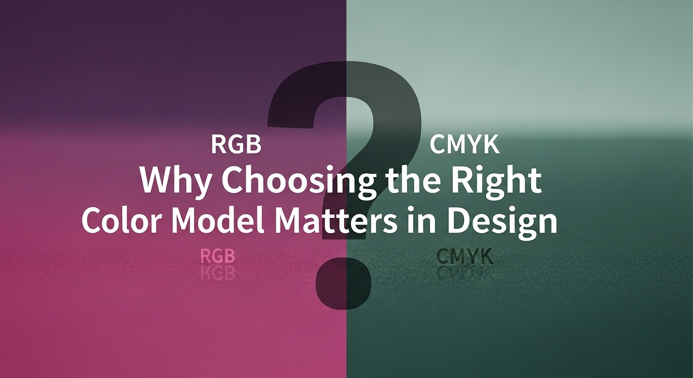
Understanding Color Models in Simple Terms
Color models are just systems used to represent colors in different environments. Some models are suitable for digital displays, while others are useful for physical prints.
The differences in color models arise because of how they handle color. Typically, we have two types of color handling:
Additive
Subtractive
In additive coloring, the source of the colors emits light in various shades that mix together to form the color you want. A good example of an additive model is RGB.
In subtractive coloring, the colors are created by subtracting specific shades from white light (on a reflected surface) using inks and dyes. A good example of a subtractive model is CMYK.
Each model handles color differently, which is why a design can look perfect on a screen but appear completely different when printed. That’s why selecting the right one is necessary.
Matching Color Models to Client Needs
So, now you probably have an idea of how color models can affect designs. The fact of the matter is that different projects require different approaches.
If a design is supposed to be used digitally, i.e., as websites, social media graphics, and mobile apps, then a color model that is optimized for screens should be used.
Print designs used in materials like brochures, business cards, and packaging require a different color handling approach.
If a designer uses a model intended for screens when preparing a print file, the colors may appear dull or inaccurate. On the other hand, using a print-focused model for digital work can result in overly muted visuals.
That’s why understanding the client’s end use is essential because even a small oversight at the beginning of a project can create major inconsistencies later on.
Common Mistakes Designers Make
Having understood the importance of color models, you can now understand how designers can make mistakes regarding them. Even experienced designers sometimes run into issues when handling colors. Some common problems include:
Starting a project in the wrong color model. It is a hassle to change it later to the right one.
Forgetting to switch models before exporting
Relying on on-screen previews without considering output differences
These mistakes often become noticeable only at the final stage, when changes are harder and more time-consuming to implement.
Fixing the Problem Without Starting Over
Fortunately, making a mistake with color models does not always mean starting from scratch. Today, modern design tools can make it easy to rectify such mistakes.
It is not impossible to change the color model later if designers start with the wrong model. In fact, a color model converter, such as an RGB to CMYK tool, or any of its other variants, can help.
Using a color model converter in conjunction with a color picker, designers can simply convert the original colors to the new model without having to completely redesign them from scratch.
Most design tools let you change the color model of a design. All designers need to do is:
- Create a copy of the original design, Use a color picker on it to identify all the color codes of the original model
- Enter the color codes into a color model converter
- Get the new converted codes
- Plug these codes back into the copy of the design
Voila! The design is now in the new color model.
As a cautionary measure, don’t forget to do a test print before finalizing the design (if the final output is supposed to be printed).
A Practical Approach to Better Design Workflow
The best way to avoid color issues is to plan ahead by choosing the right model at the start. However, flexibility is just as important. Design projects often evolve, and requirements can change midway.
Having access to the right tools ensures that even if something goes wrong, you can fix it without disrupting your entire workflow.
Conclusion
Choosing the right color model is a fundamental part of design work that directly impacts the final result. While it is always best to start with the correct setup, mistakes can happen.
By understanding how different color models work and using practical tools when needed, designers can maintain accuracy, improve efficiency, and deliver consistent results across both digital and print media.
Frequently Asked Questions
1. What happens if I design a print project in RGB?
If you design for print using RGB, the colors will likely appear duller and less vibrant once converted to CMYK because RGB has a wider gamut than standard printing inks can reproduce. You may also experience unexpected color shifts, especially with bright blues and neon tones.
2. Can I convert a design from CMYK to RGB without losing quality?
Yes, converting from CMYK to RGB is usually safe and results in brighter colors for digital screens. However, the opposite conversion (RGB to CMYK) often requires manual adjustment to ensure colors translate accurately to print.
3. Is it enough to just change the color model in my software settings?
Not always. Changing the document settings converts the color values, but you should always double-check critical colors (like brand logos) against a color guide or use a color model converter to ensure they match the intended output.
4. Why does my design look different on my phone compared to my computer?
Even within the same color model (RGB), different screens have varying calibrations, brightness levels, and color gamuts. This is a hardware limitation. For consistency, test your digital designs on multiple devices.
5. What is the best way to ensure color accuracy for a client’s brand?
Always ask for the client’s brand guidelines. If they provide specific color codes (such as Pantone, CMYK for print, and HEX for web), use those exact values. Never rely solely on visual matching from a screen. For critical print jobs, always request a physical proof.